Pink, Coral, Blush … My favorite Valentine’s Day hues!

It’s no secret that one of my favorite colors is pink. In honor of Valentine’s Day, I thought it would be fun to share a few of my favorite pink-infused spaces. After all, I really do believe pink is a neutral color that can look beautiful in any home.
In the Living Room
For the Agnew home, we used a subtle deep salmon hue to add warmth to a once dated space. The living room is one of a home’s hardest-working rooms and it can certainly be overwhelming to paint the walls a vibrant shade of any color, let alone pink. However, this soft pink shade worked perfectly on this built-in as it doesn’t overpower the room.
My recommendation is to find a more “neutral” pink that blends with your home’s style. This tone is great for a welcoming environment, especially in the living room.

Paint: Farrow and Ball Dead Salmon
In the Bathroom
Often, homeowners tend to stay away from pink. However, when renovating the Lemery home, Trisha shared how much she loves pink and would love to see it in her and her husband’s bathroom in some way. He agreed with the idea and I set out to find just the right tile to add a unique, contrasting style to the concrete floor. The pale pink was both fun and fitting for this home’s sophisticated look.


Tile: Tom January Flooring
While the paint at the Welcome Inn is a bit cooler than the Lemery bath, the environment still welcomes and relaxes you. It works with the historic elements of the home without changing the overall character. When it comes to bathrooms, my recommendation is to use a subtle blush tone in order to create a serene and relaxing atmosphere.


Paint: Benjamin Moore Dusty Road #1017
In the Bedroom
I could talk all day about the Welcome Inn. I know I say it a lot, but it really is one of my favorite projects, especially when it came to designing “the pink room.” When we bought the house, the upstairs bedroom walls were covered in pink wallpaper with delicate florals. Wanting to honor its history, I worked with Kelly Ventura to create a wallpaper loosely based on the original. The simple design and large scale floral artwork adds to the charm and character of the home.

Wallpaper: Kelly Ventura
In a Kid’s Room
I always love designing a kid’s bedroom or a nursery because they give me a chance to get creative and have some fun. For the Smith nursery, we were able to surprise the couple with the gender of their baby. This meant we had to include some fun shades of pink for their baby girl! To bring soft, pretty colors to this room, I chose muted pastels. The rainbow on the wall represents a promise, like the one given by God to Noah. This baby girl embodies what Aaron and Brook have waited and longed for, in spite of Brook’s health challenges and working toward a long-term home. My hope for this nursery was for it to be a visual symbol of the promise that joy always returns, even after suffering. The soft colors helped to create the perfect environment to welcome their new baby girl.
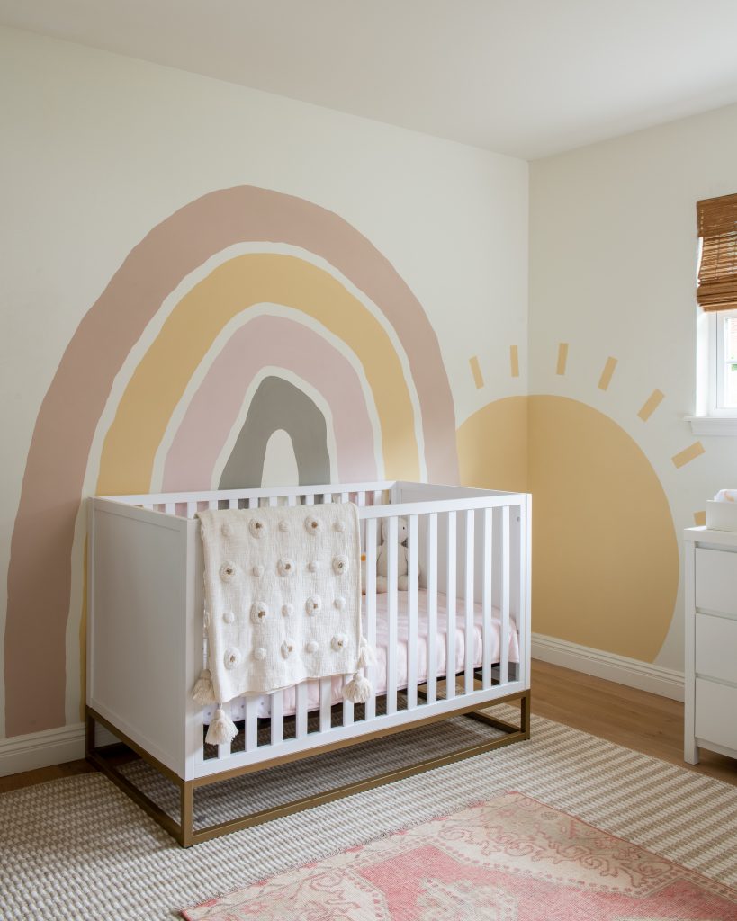
Pink Paint: Farrow and Ball Setting Plaster
For kid’s bedroom,I love using different shades throughout the space. In the Lemery home, Dave built the adorable bed and I knew it needed some fun pinks to make it the perfect space for their granddaughter. Using light and dark tones sparingly works well to create a balanced space. From the flamingo painting to the new bedding, I love how this space looks with just a few pops of pink!


In the Kitchen
Our homeowner, Gayatri, had a beautiful painting hanging in her old kitchen that was colorful and read: This Kitchen is Made for Dancing, yet her current kitchen didn’t reflect that intention.As soon as I saw the painting, I knew it would be the inspiration for the new kitchen design. Her kitchen needed to be colorful, roomy enough for impromptu dance parties and full of joy. After all, that’s exactly what a kitchen should be – a place where you are surrounded by love.
I used the painting’s color palette for the kitchen – muted greens and yellows along with bright pink. These colors were incorporated into the cabinets, backsplash tile and of course, the range. The bright pink range was a risk but I just knew Gayatri would love it. She absolutely did and even named the range, “Ophelia”. I know a bright pink range isn’t for everyone. But, it’s perfect for Gayatri and her kiddos. And, that’s absolutely all that matters.
So, Ophelia and I give you permission to make a change today. Whether it’s a bold choice like a pink range as the focal point of your kitchen or something as simple as taking a new route to the office just to mix up your routine. Let’s all focus today on bringing a little more joy into our homes. We only get one chance at this wild, wonderful life. It’s too short to waste on anything other than dancing in our kitchens with the ones we love. So let’s do it. Add the pink, just like we did in the Agnew home.


Range: Ilve
On the Exterior
For our “Rock the Block” house, I knew I wanted to stick with a Charleston coastal aesthetic. I found myself drawn to the natural patina of the historic homes and buildings in the city. Whenever we went exploring along the cobblestone streets of Charleston, I filled my camera roll with colorful, character-filled homes.
We knew a bright pink home, like you’d find on Rainbow Row, would be too stark on the block so I chose my favorite blush shade and we added pops of muted blue-gray on the shutters and for the traditional haint blue southern porch ceiling. In my opinion, you can’t help but smile when you live in a pink house!

Paint: Sherwin Williams Classic Sand
Wishing you all a beautiful day surrounded by the ones love (and the color pink)!!